Background
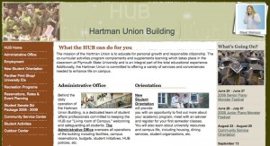
The Hartman Union Building (HUB) website was primarily designed to provide information about student organizations, upcoming events, and facility availability. The site was designed using bright colors that varied from section to section and fancy fonts. This gave the site a fun, energetic feel.
Problem
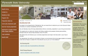
Over the last couple of years Plymouth State University’s Web Administrator has been unifying the design of departmental websites as well as converting them to a content management system. When it came time to convert the HUB website, the web administrator wanted the HUB website to have a unified design, while the HUB staff wanted to maintain the unique, “fun” feel of the site. The web administrator allowed me some leeway in the re-design but required that I use the same colors and basic layout as other department sites.
Problem Solved!
What I came up with was a slightly “grunge” header with softened lines. I call them fuzzy lines.

