Monthly Archives: May 2009

RD Menu: reducing report time from hours to minutes

Background

The RD Menu generates housing reports for Residential Life staff. These reports provide a range of options from generating a complete roster of students in alpha order to finding housing information for individual students.

The Problem

The original menu was created in Microsoft Access approximately five years ago; however, many of the reports took more than 20 minutes to run and some took nearly all day. The housing coordinator found this delay especially frustrating because she depended on those reports to accurately assign student housing.

Problem Solved!

Although originally tasked with optimizing the SQL in Access to reduce report times, the minutes saved were not satisfactory enough. I suggested, as a test, to re-create a report as a web application to discover if we could reduce the time it took to generate reports more. Reports which took 15-20 minutes in Access became virtually instantaneous in the web interface. Problem Solved!
Hartman Union Building: re-design

Background

The Hartman Union Building (HUB) website was primarily designed to provide information about student organizations, upcoming events, and facility availability. The site was designed using bright colors that varied from section to section and fancy fonts.  This gave the site a fun, energetic feel.

Problem

Over the last couple of years Plymouth State University’s Web Administrator has been unifying the design of departmental websites as well as converting them to a content management system.   When it came time to convert the HUB website, the web administrator wanted the HUB website to have a unified design, while the HUB staff wanted to maintain the unique, “fun” feel of the site.  The web administrator allowed me some leeway in the re-design but required that I use the same colors and basic layout as other department sites.

Problem Solved!

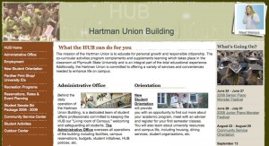
What I came up with was a slightly “grunge” header with softened lines. I call them fuzzy lines.

Picture 1: The fuzzy edged, relaxed HUB design
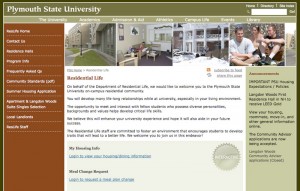
Picture 2: The hard-edged design of other department websites